Call us 020 3887 6113
Paint Inspiration From Our Favourite Designers
How to Guides | 01.07.2020
Over the past few weeks, we have introduced you to a selection of our favourite colours from the new paint collection. However, once you've fallen in love with a shade, it's not always clear how you can incorporate it into your interiors. Paint can be a powerful tool for transforming the character and feel of a space, but the idea of filling a whole room with one colour can often feel a little daunting. Luckily there are lots of different and unique ways you can use paint to add a splash of colourful joy into your home, other than plastering it across all four walls. To help inspire you, we headed straight to our Interior Design Review book to gather some ideas from a selection of our favourite designers on how to harness the power of paint.

For those brave enough, flooding a space with a single colour makes a real design statement. Matthew Williamson has turned an unassuming hallway into a feature in its own right with this gorgeously rich fuchsia colour. The bold shade is repeated in the curtains, the lampshade and some of the ornate picture frames too, as well as allowing the unappealing radiator to slip into the background. But if you're not ready for such a full-on use of colour then weave your favourite shade throughout your space, picking it up and repeating it across furniture, window frames and upholstery. Take inspiration from Mary Douglas-Drysdale who uses this stunning sunshine yellow for a large piece of furniture, which is then echoed throughout the room in the window alcove, cushions, chair covers, table cloth and even the flowers. Ligia Casanova has used the same technique in this bright and airy living space. Painting the kitchen cupboards, window frames and metal dining chairs in the same soft pale blue gives coherency to such a large, open plan room. For a similar look, try our Firefly or Lake Tekapo in a satin finish which will give a fresh glow to wooden surfaces and is easy to wipe clean.

Photo: Mary Douglas-Drysdale

Photo: Ligia Casanova
Large, contemporary rooms offer plenty of space to play with big blocks of colour, sculpting unique features in minimalist style spaces. See how Gary Zeng creates drama in this sleek and modern monochromatic home with a bold block of red in the stairway, a similar punchy shade to Moroccan Souk. We also love this series of rooms designed by Yang Jun, each has its own daring colour palette creating a stunning visual effect as you look through all three spaces. From pale, stony grey to vibrant lilac and vivid turquoise the colours seem to simultaneously clash and compliment each other. This clashing technique is also used by Design Intervention who have gone for a bold combination of primary red as a background for this beautifully curved staircase in a sugary powder pink.

Photo: Gary Zeng

Photo: Yang Jun

Photo: Design Intervention

Photo: Daun Curry

Photo: Alexandr Yakimov and Alexandr Potemkin
Sometimes a flash of vibrant colour is all you need to change up your space and this bright purple ceiling from Interior Designer of the Year 2019, Daun Curry, is a fantastic example. Hallways are too often forgotten about, but they can be great spaces to inject some fun and character into your home. This vibrant flash of colour is echoed in the neon sign and turns a dark hallway into a fun and characterful area of the home. Alexandr Yakimov and Alexandr Potemkin have employed a similar technique in this stairway, balancing a dark grey with a soft and feminine peach, a striking contrast tied together by the framed graphite drawings.
For another way to add a splash of colour see this space designed by Han Qingsong, who has painted the back of these shelves in a magnificent bright teal shade, similar to Kingfisher. This clever technique allows him to introduce another colour into this soft scheme full of natural wood textures, as well as allowing the yellow accents to pop even more.
However, a two-tone scheme doesn't have to be in bright colours to add interest. Heidrun Diekmann brings originality to a black and white paint palette by painting just halfway up the walls. An effect repeated in different heights throughout the home. This is a look that requires commitment, choose your line and follow it consistently around the room making sure to include doors and window frames.
For a softer approach take inspiration from Daun Curry's walls that look almost dip dyed as white fades swiftly into black two thirds of the way down the walls. Whichever colours you use this technique can be used to create an illusion of more space, giving the impression of taller ceilings and wider walls.

Photo: Han Qingsong

Photo: Daun Curry

Photo: Heidrun Diekmann
Finally, a space that is often neglected when it comes to painted colour is the garden, but introducing bright tones can help to bring sunshine into your outside space even during winter months. Take inspiration from Matthew Williamson and these tomato red chairs which enhance the warmth of this sunny terrace and are complimented by the lush green door shutter mimicking the green of the climbing vines. To freshen up your space for summer we suggest using a gloss finish to paint antique, metal outdoor furniture, and don't be afraid to go for a vibrant hue such as Dutch Tulip, Carnival Headdress or Persian Lime. Alternatively you could use Scottish Heather or Nantucket Blue to follow in the footsteps of Denton House, and recreate this soft and calming blue backdrop for potted plants.

Photo: Matthew Williamson
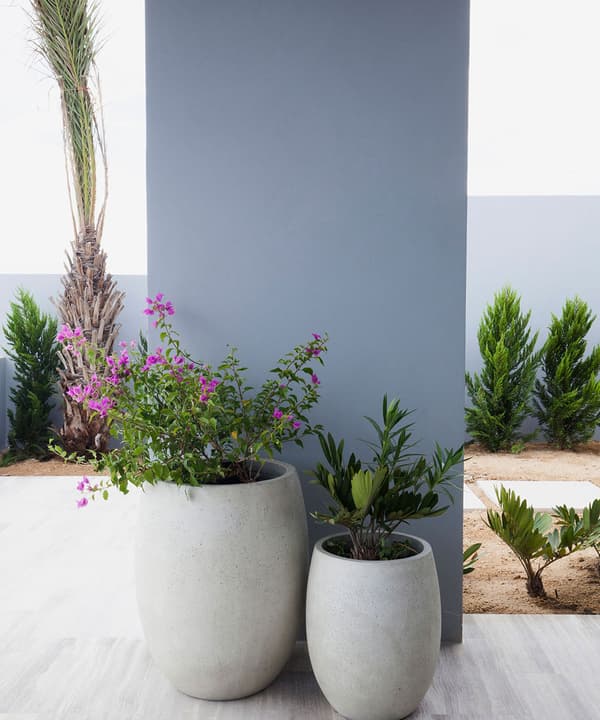
Photo: Denton House
